 how-to
How to Stage a Small Living Room for Photos: 2026 Guide
Table of Contents
- Why Camera-Ready Staging Beats Standard Decorating
- How to Make a Small Room Look Bigger in Photos
- Best Furniture Layout for Small Living Rooms
- Decluttering Tips for Real Estate Photography
- Lighting and Color Choices That Photograph Well
- DIY Staging Props and Post-Production Fixes
- Frequently Asked Questions
Last Updated: September 21, 2026
Why Camera-Ready Staging Beats Standard Decorating
Most sellers decorate a room to live in. But when you need to know how to stage a small living room for photos, you're styling for a lens, not for daily life. That's a different job entirely.
How to Make a Small Room Look Bigger in Photos
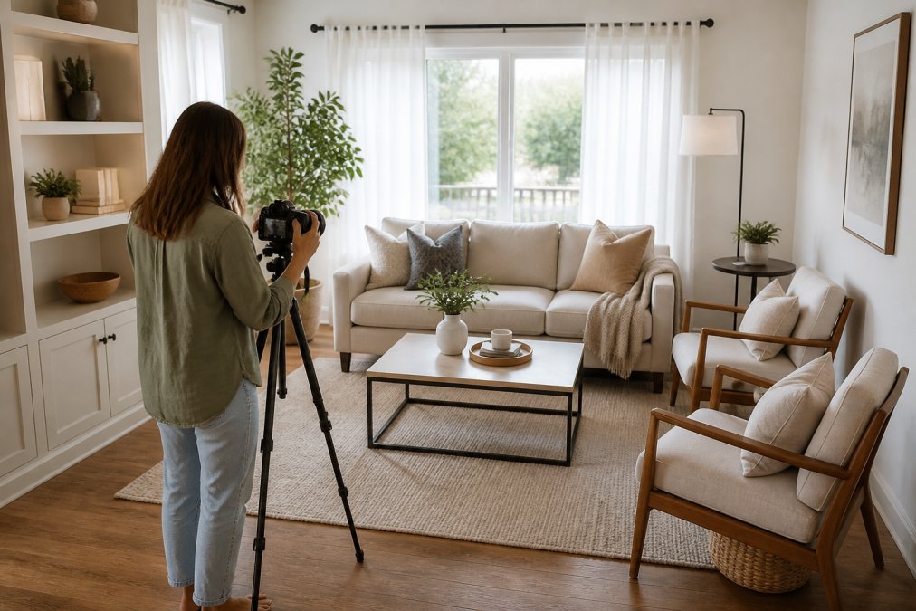
The fastest way to make a small room look bigger in photos is to shoot wide with the camera held level. Wide-angle lenses capture more of the room, and a level camera keeps vertical lines straight. Tilt the lens down and walls lean inward, which shrinks the space.
Here's the core setup:
- Use a wide-angle lens, not a phone's default zoom
- Set camera height near chest or eye level
- Keep the camera level so vertical lines stay true
- Step into a corner to capture the widest view
Wide-Angle Lenses, Camera Height, and Depth of Field
Depth of field is the zone of the photo that stays sharp. A wide lens keeps more of the room in focus, front to back. That helps a small space feel open.
Best Furniture Layout for Small Living Rooms
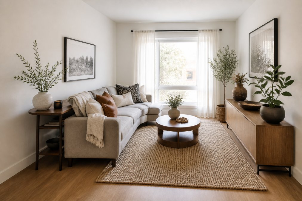
The best furniture layout for small living rooms keeps a clear path through the room. Pull furniture off the walls and let it breathe. A sofa pushed flat against a wall can make a room feel boxed in.
Traffic Flow, Negative Space, and the 2/3 Rule
Traffic flow is the path people walk through a room. In photos, an open path reads as space. Block it and the room feels tight.
A helpful comparison:
| Layout Move | What It Does for the Photo |
|---|---|
| Sofa angled in a corner | Adds depth and breaks the flat wall line |
| Slim console behind sofa | Fills space without crowding |
| Clear walkway to window | Draws the eye toward light |
| Two-thirds furniture fill | Keeps the room feeling open |
Decluttering Tips for Real Estate Photography
Decluttering tips for real estate photography start with one rule: remove anything the camera doesn't need. Every extra object adds visual weight. Visual weight is how much attention an item pulls in a photo.
Clear these first:
- Counters, coffee tables, and shelves
- Personal photos and fridge magnets
- Cords, chargers, and small appliances
- Extra seating and side tables
Lighting and Color Choices That Photograph Well
Lighting and color decide whether a room looks warm or dim, but the camera sees light differently than your eye does. Your eye adapts to mixed light sources automatically. A camera does not. That gap is why a room that looks fine in person can photograph with orange walls on one side and blue walls on the other.
Shoot With the Light, Not Against It
Natural light is still your best tool, but the timing matters more than most guides admit. Shoot when the room gets its brightest, most even light, usually mid-morning or mid-afternoon, depending on which way the windows face. A south-facing window floods a room all day; a north-facing window gives soft, consistent light with no harsh shadows. East and west windows swing from dim to blazing within a couple of hours, so a shoot scheduled at the wrong time can wreck an otherwise good room.
Why You Still Turn the Lamps On
Here is the counterintuitive part: you turn the lamps on even in daylight. A mix of natural and warm artificial light fills the corners that daylight misses and adds depth to the shot. A room lit only by a window gets bright near the glass and muddy in the far corners, and the camera exaggerates that falloff.
Set White Balance on Purpose
Most phone cameras and DSLRs default to auto white balance, which guesses at the correct color and often guesses wrong in a mixed-light room. If your camera allows it, set white balance manually to match the dominant light source, daylight, tungsten, or a custom reading off a white card. If you are shooting on a phone, tap the screen on something white (a wall, a sheet of paper) before you shoot so the camera locks its reading there.
Color Choices That Survive the Lens
For paint, lean on neutral tones, warm whites, soft grays, greige, and one accent wall. Neutrals keep the room bright and reflect light back into the space. A single accent wall adds interest without shrinking the room, and it gives the camera a focal point to lock onto.
Bright, even light plus a soft color palette makes small rooms read as larger. Match your bulb color temperature, set white balance on purpose, and avoid dark paint, those three moves fix the color problems the camera exaggerates.
If you can only change one thing before the shoot, change the bulbs. Matching color temperature across every lamp in the room is the cheapest, fastest fix for the orange-and-blue color cast that ruins small-room photos.
Do not mix daylight and warm bulbs and hope auto white balance sorts it out. It will not. The camera picks one temperature as white and turns everything else orange or blue, and that cast is hard to fully remove in editing.
DIY Staging Props and Post-Production Fixes
Most staging guides assume you own a professional prop inventory. You do not need one. The two halves of a camera-ready small room are what you put in front of the lens and what you fix after, and both can be done with household items and free or low-cost editing tools.
DIY Props You Already Own
The goal of a prop is texture layering, mixing materials so a flat two-dimensional photo reads as having depth. You are not decorating. You are giving the camera surfaces and shadows to catch.
A working prop kit pulled from around the house:
- Neutral throws and blankets. Drape one over the arm of a sofa or the back of a chair. Fabric adds softness and breaks up hard furniture lines.
- Stacked books. Two or three hardcovers, spines turned so titles are not legible, add height and a horizontal line to a coffee table.
- A single plant or a few stems in a vase. Greenery adds a color accent and a vertical element. One is enough; three is clutter.
- A bowl or tray. A shallow bowl on a coffee table corrals small items into one visual unit instead of five scattered ones.
- Ceramic or wood objects. A small vase, a candle, a wooden bowl, anything with a matte finish that catches light differently than fabric.
- A mirror. A mirror on a wall opposite a window bounces light back into the room and, in the photo, doubles the perceived depth.
The Vignette Rule
A vignette is a small, self-contained arrangement, a tray with a candle and a book, a stack of books with a plant on top. Vignettes give the eye a place to rest and make a small room feel intentional rather than empty. Build one on the coffee table and one on a console or shelf, and leave the rest of the room clean.
Post-Production: Fixing What the Camera Exaggerates
Editing is the second half of staging, and it is where small-room photos are won or lost. The camera exaggerates three things in particular: vertical lines that lean, shadows that go black, and color casts that turn walls orange or blue. All three are fixable in editing.
A basic post-production workflow:
- Straighten vertical lines. Lens distortion bows walls and makes them lean. Most editing apps have a lens-correction or perspective tool that pulls verticals back to true. This alone makes a small room look larger and more stable.
- Lift the shadows. Small rooms have dark corners the camera renders as pure black. Raising the shadow slider recovers detail and makes the room read as evenly lit.
- Correct the color cast. If one wall is orange and another blue, adjust white balance or use a selective color tool to neutralize the cast. This is the fix for the mixed-bulb problem described above.
- Remove distractions. Cords, chargers, a stray remote, a trash can, most editing apps have a healing or clone tool that erases small objects cleanly. Removing a visible cord is faster than re-shooting.
- Brighten, do not blow out. Raise overall exposure slightly, but watch the windows. A blown-out window is acceptable; a blown-out wall is not.
What Editing Cannot Fix
Editing is not a substitute for staging. It cannot add floor space, un-crowd a room, or fix a bad camera angle. If the furniture layout is wrong or the room is cluttered, no amount of editing will save the shot. Stage first, then edit.
Shoot one extra frame of every angle with the room completely empty of small props, then shoot the styled version. If a prop looks wrong in editing, you have a clean plate to composite from, or a fallback shot that still works.
DIY props give the camera texture and depth; post-production fixes the lines, shadows, and color the camera exaggerates. Do both, in that order, and a small room photographs like a larger one.
To sum up the full process:
- Declutter every surface
- Rearrange furniture for traffic flow and negative space
- Match bulb color temperature and set white balance
- Style with three to five DIY props in one or two vignettes
- Shoot wide, level, and at chest height
- Straighten verticals, lift shadows, and correct color in post-production
Frequently Asked Questions
How do you arrange furniture in a small living room for the best photo angles?
Pull furniture away from walls and angle the main sofa toward the room's focal point, like a window or fireplace. Leave at least 2 feet of walkway so the camera captures depth. Use a wide-angle lens from a corner at chest height, and remove any piece that blocks sightlines. This creates the openness buyers expect in small living room photos.
What is the 2/3 rule for living room furniture placement?
The 2/3 rule says your main furniture piece should take up about two-thirds of the wall it sits against. In a small living room, a sofa that covers the full wall makes the room feel cramped on camera. Leaving one-third of the wall visible creates breathing room, which reads as more square footage in photos.
Should I remove personal items when staging a small living room for real estate photos?
Yes. Remove family photos, fridge magnets, medication, and anything with a name on it. Buyers need to picture themselves in the space, and personal items break that mental image. Keep a few neutral accessories like a stack of books or a simple vase. This also supports decluttering tips for real estate photography that agents use to speed up sales.
How can I make a small room look bigger in photos without buying new furniture?
Use what you have. Rearrange furniture to open floor space, swap heavy curtains for sheer panels, and add a large mirror opposite the main window to bounce natural light. Remove one piece of furniture entirely, like an oversized armchair. A professional photographer can also correct lens distortion and brighten shadows during post-production.
Staging a small living room for photos takes planning, but the payoff is real. Buyers judge a listing in seconds, and the first photo sets the tone. Desert Home Photography handles the hard parts for you, with hand-blended imaging, FAA-licensed drone photography, and immersive virtual walk-through tours that show a home at its best. Get started with Desert Home Photography and turn a small room into a listing buyers want to see. Call or text to book your shoot.